top of page
Caution: This whole project is currently under redesigning process. 90%/100%


Dinero - Investing App
Dinero is an end-to-end app with innovative approach to investing, you're in the driver's seat. The platform help you invest in a diverse range of assets, including crypto, stocks, and more, all from one convenient place, and is a home for learning and sharing ideas. Whether you're a seasoned investor or just starting, Investify caters to your unique preferences and goals.
Year
2023
Sector
Fintech, My Portfolio
Skills
Product Design, UX Research
Tools & Software

Project Size
4
Weeks
76
Screens
392
Components
8
Flows


📛 Problem Statement
Why is it so difficult to invest?
In today's rapidly evolving financial landscape, investors face numerous challenges when seeking to build and manage their investment portfolios effectively. Existing investment platforms often lack comprehensive solutions, leaving users grappling with disjointed experiences and limited opportunities.
Investors are often forced to use multiple platforms to access different asset classes, resulting in a disjointed user experience and added complexities such as:
- 🚪 High enterance level
- 🔭 Conducting research
- 💸 Fear of losing money
- 📈 Fear of market volatility
- 💼 Managing a diverse portfolio
- ㊙️Complex language
🧑💻 My Role
Product Designer
As a Solo Product Designer & UX researcher in this project, I am responsible for conducting user interviews and usability studies, synthesizing user insights, crafting user-centric interfaces, and iteratively refining designs based on feedback. My goal is to showcase my skills in creating a seamless and engaging app experience backed by user research and design expertise.
Preview


Buying Stock Flow
Onboarding Flow
Change Payment Method Flow
Open Learning Video Flow
for those in a hurry

Research

Design System

Testing

UI Design

UX Design
Research


🔬 Research
Competitors
To understand the current market landscape and identify opportunities, I conducted a thorough analysis of competitor investing apps by entering their reviews in the app store - to see what are the most common problems. This analysis provided insights into the strengths and weaknesses of existing solutions and allowed us to identify potential gaps in the market.


Problems with competitors - screenshots from the Play store

🔬 Research/Understand
Survey
I conducted interviews and surveys within several investors Facebook groups, seeking to understand user needs. Key survey questions included:
- How do you approach investments?
- What's your confidence level in decision-making?
- What influences your investment decisions?
- Which investment products do you use?


Survey results displayed on several graphs
🔬 Research
Empathy Map
By creating a customer empathy map, I gained a deep understanding of the target user's mindset and needs, enabling us to craft design that catered to their unique requirements. The empathy map played a pivotal role in ensuring a user-centric and rewarding experience for the "Idan Cohen" Persona.

🔬 Research
Personas
Based on the user research, I created 5 detailed user personas (which you can see in the Tech Doc) that represented different types of investors with varying needs and preferences. In here I will focus on one main persona - Which is Idan Cohen, Who is representing my main audience and main users group.

🔬 Research
Affinity Map
Using the affinity map technique to organize and analyze user feedback more effectively. Clustering user insights, comments, and observations based on common themes and patterns will identify recurring pain points and popular features, enabling prioritized design changes for an improved user experience.

🔬 Research
User Stories
1. As Idan, a beginner investor, I want to have access to a wide range of assets, so that I can easily diversify my investment portfolio and explore different investment opportunities.
2. As Idan, a beginner investor, I want to view educational content, in order to further enhance my knowledge.
3. As Idan, a beginner investor, I want consult with other investors, in order to make informed decisions
🔬 Research
Crazy 8's
Ahh, my favorite workshop. In Crazy 8s, I rapidly generated 8 creative ideas for the app, ranging from an investment simulator and gamified learning to leaderboards, personalized newsfeed, goal tracking, one-tap investing, robo-advisor integration, and investment insights dashboard.


🔬 Research
User Flows
I mapped out user flows to understand how users would interact with the app at different stages, from onboarding to making investments. This helped in identifying potential pain points and areas for improvement in the user journey.
Here is an example of one of them, presenting the "Buying Stock" flow:


Conclusions
💡 Conclusion #1
Finding The Right Source
Many investors and interested beginners have hard time in research and finding educational source because of their fear of losing money & that the existing educational sources are with complex jargon - which makes them think twice before risking their own money.
💡 Conclusion #3
Balancing Complexity & Simplicity
Financial jargon and technical language can be intimidating to those unfamiliar with investing. While seasoned investors might appreciate in-depth analysis and complex tools, beginners may find such features confusing and discouraging, hindering their engagement, and making them even more distant from investing.
Business Model

UX Design

📇 UX Design
Whiteboard Sketches
Sketching is an iterative process. So I created several versions of the sketches, refining the layouts, and overall composition based on feedback and further insights.
Before starting the sketching process, I reviewed the user personas, user stories, and any relevant information about the screens' content and functionalities.
Once the whiteboard sketches were finalized, they served as a reference when moving on to more detailed design stages.


📇 UX Design
Low & High Fidelity
First, I was drawing a low fidelity sketch, to visualize the UX idea of the screens that I sketched in the whiteboard session to help me create more ideas from association of the previous section of the screen. It helped me to think about new and critical cards and information visualizing. Shout-out to UXI Live for the notebook to sketch on!


Design System

📱 Design System
Typography
The typeface was a difficult choice. On the one hand, you need a simple and clean font to deliever the messege, and on the other hand, it must not be too boring otherwise it will feel cheap and non-professional. That's why I went for a very well-known font, but not well-known enough to be over-used. Like Plus Jakarta!

📱 Design System
Text Input
Designing minimal text placeholders can greatly enhance the user experience of an app. By utilizing minimalism in text placeholders, the design achieves a clean and uncluttered aesthetic, allowing the content to take center stage. This approach creates a sense of simplicity and elegance, while providing a clear focus on the intended input.


📱 Design System
Color Pallette
While blue is a popular color for fintech apps due to its associations with trust, stability, and security - purple's association with luxury and royalty can evoke a sense of exclusivity and premium service, enhancing the app's perceived value. Additionally, purple is less commonly used in fintech apps than blue, which can help the app stand out and differentiate itself from competitors.


📱 Design System
Components
They're all beautiful and good, but they aren't here because of their beautiful eyes (or purple stroke). I created cohesive design system components. Process included brainstorming, wireframing, UI design, and iterative refinements. Focused on consistency, accessibility, and user-centered aesthetics for unified experience
Flows & Design


Features


Features

💫 Features
Features Document
To create impactful features, I summarized the entire process by identifying user pain points, mapping them out, and crafting straightforward solutions for each issue. This approach provided a clear roadmap for the design process, helping me determine where to concentrate my efforts and where to empathize with users to ensure that the app truly addresses their needs.


💫 Features
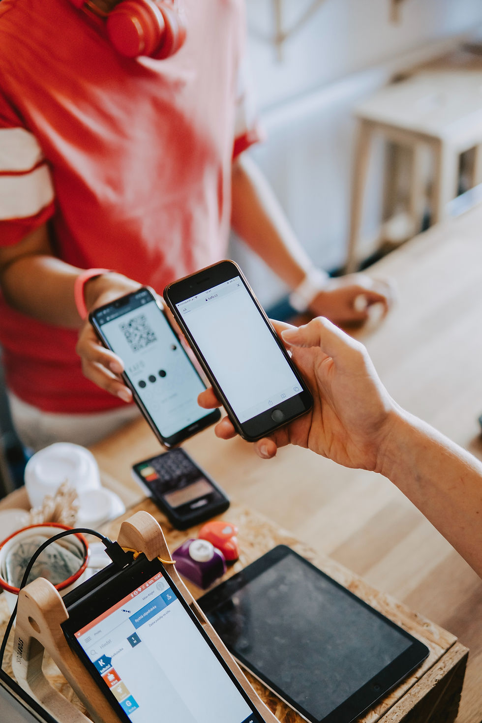
The Idea
QR are everyhere. They're known, noticable, easy to use and normal in our time. One of the flagship elements of the smartphone era is convenience and speed. Everything should happen as quickly and conveniently as possible, while let them to it from the same app - which contains their finance balance and the numbers infront of their eyes anytime.


💫 Features
Problem Statement
In a world with NFC, the payment methods In the traditional way pain-points are the inconvenience and time-consuming nature of traditional transactions. Cash transactions often involve the need for exact change, counting bills, and waiting for receipts, which can slow down the payment process. Additionally, another payment methods like checks may require additional verification and manual processing, leading to delays and potential errors.


💫 Features
Solution Statement
By implementing QR code scanning functionality within the app, users can easily initiate transactions using various payment options such as credit cards, digital wallets, or even stocks & crypto. This approach provides users with the flexibility to choose their preferred payment method while enjoying the convenience of QR code scanning.
Additionally, this solution simplifies the experience for businesses, as they can accept payments from a wide range of sources through a single app.


💫 Features
Problem Statement
Over the years, it is more and more difficult to choose a special gift. Just as it is difficult and complex to choose stocks and investments. In addition to the fact that every act of buying and selling assets and stocks creates a tax event, or including the risk of the person won't love the gift you bought them.


💫 Features
Problem Statement
Investment apps often face the challenge of keeping users engaged and informed beyond basic account management. Without a newsfeed feature, users may have to navigate to external sources for market news and updates, disrupting their investing workflow and potentially causing information overload. beside that I didn't want Dinero to be another social media platform, nor making it an "too many features" app.


💫 Features
Solution Statement
By adding the newsfeed feature to the menu and not to the bottom main bar - I made this app mainly an investing platform, but with a "nice to have" feature, that's not taking the focus and making it a social media app. The newsfeed feature enhances user engagement, promotes active participation, and ultimately empowers investors with the knowledge they need to stay ahead in the dynamic world of finance.


💫 Features
The Idea
Investing app revolves around enabling users to replicate the investment strategies and actions of other successful investors or influencers' automatically executing the same actions in their own portfolio. This allows users to benefit from the expertise and decisions of others, saving time and effort while potentially achieving similar investment outcomes.


💫 Features
Problem Statement
Everybody want to invest exactly like Warren Buffet. But how many people knows exactly and in real time what is he investing in? the problem of knowledge and experience gaps faced by many novice investors and inexperienced investors often causing struggle to make informed investment decisions or lack the time and expertise to conduct thorough research.


💫 Features
Solution Statement
I combined both the ideas of copy influencers portfolios, and investing small amounts effortlessly from the Crazy 8's workshop I did, And this feature solves this problem by allowing users to mirror the actions of seasoned investors or influencers, leveraging their knowledge and strategies. It provides an opportunity for users to benefit from successful investment approaches, reducing the learning curve and increasing their chances of making profitable trades. Additionally, it promotes accessibility and inclusivity in the investing world, empowering individuals who may not have the confidence or resources to make independent investment decisions.
User Testing


🧑🤝🧑 User Testing
Meet Roy Fimiamov
Roy is a 20 years old man, Working as a hookah store manager & a student, who wants to invest but don't know where to start. He knows that its importnant but the overload of this realm is making him overloaded and delay the starting point. Roy is representing the persona of Idan Cohen.

🧑🤝🧑 User Testing
Meet Lenny Whitman
Lenny is a 21 years old man, working as a musician & music producer, who started to invest but wants to learn more and enrich his knowledge. Lenny already knows the basics and investing his money, but he knows that there is alot to learn, and he is looking for a place to learn bit by bit. Lenny is representing the persona of Idan Cohen

🧑🤝🧑 User Testing
Meet Daniel Rivkin
Daniel is a 22 years old man, working as a Mechanic with a P.E Degree, who started to invest but want to learn more and enrich his knowledge. Daniel already knows the basics and investing his money, but he knows that there is alot to learn, and he is looking for a place to learn bit by bit. Daniel is representing the persona of Idan Cohen

🧑🤝🧑 User Testing
Testing Process
As you can see in the video,
I designed a set of tasks that participants would perform using the prototype. These tasks were designed to cover various features and interactions within the onboarding process.
I took detailed notes during each testing session, capturing both verbal and nonverbal feedback. This included comments, hesitations, facial expressions, and any observed usability issues.
Once all testing sessions were complete, I reviewed my notes and compiled the feedback. I looked for patterns in user behavior, common pain points, and recurring suggestions for enhancements.
Feedbacks Implements
🗣️ Feedbacks
Problem - Visual Porfolio
One of the problems that came first is that it is impossible to visually see what share is dominant and what is the "weight" of each share in the portfolio, and this requires the user to calculate manually and create the visual image in their head or draw it on a paper. Which caused a bad user experience

🗣️ Feedbacks
Problem - Specific Order
Another problem that arose is that the way to make a specific order is not clear and is not "in front of the eyes", and this may result in mistakes being made when entering a position, and also is determining the user a specific way to enter a position, Unlike the competitors that letting them choose their own way with professional and convenient tools.

🗣️ Feedbacks
Solution - Conditional Order
I placed the order options at the beginning of the flow next to the traditional buying and selling, as a "professional" option for the more knowledgeable users, next to the existing and "simpler" option, thats giving the user choose the most convenient option for him.
A quick messege for you


© 2023 by Yarden Zafrir
Made with alot of energy drinks & coffee
bottom of page